been a while since i made my own sig, decided to give it a shot, and came up with this sig. its meant to be rather simple, nothing extraordinary or extravagant. thoughts?
same thing, with border:
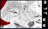
i personally think the first one works better for the forum's "blue solution" skin.
' Wrote:One I'm working on for jeremy's order pilot... decided to start playing around with GIMP's filters and such to see what could be achieved.
I love the concept, Tenacity. Creative, at the very least. Still, much as the idea itself is very cool, the quality of the ship render as well as that of the text could be better; it's mostly the ship, though. It seems kind of flat without any lighting, sort of like a HardCMP render. (Which maybe it is, dunno.) It worked well for your blueprints of the inside of the carrier because of that same flatness, but here you might want to see if anyone can make you a high-quality render with the same view.
Ohnoes, paragraph.:unsure:
THEY TOLD ME I COULD BE ANYTHING SO I BECAME A SIGNATURE PLS HLP
Use the new one. And I still dunno where the guy reminds me off. It's a game. Legacy of kain, one of those? Dunno. Anyway, the new one's curve just improves the whole and eliminates the desire for a border.
Tenacity: What they said. It looks rather... Plain. Perhaps get a side view slightly adjusted so its not 90 degrees to one side (or above as is), and have the fiery puff-jets that away.
Serpentis: I vote the one you are currently using. Very awesome indeed. But maybe that's my infatuation with sig solidity again...

![[Image: Serpentis.gif]](https://sig.grumpybumpers.com/host/Serpentis.gif)


![[Image: 12.png]](http://i84.photobucket.com/albums/k13/gurjiv/admin/12.png)
![[Image: razrsig1.png]](http://i84.photobucket.com/albums/k13/gurjiv/admin/razrsig1.png)
![[Image: 5d1144bd1.png]](http://i84.photobucket.com/albums/k13/gurjiv/5d1144bd1.png)
![[Image: 20zctv7.png]](http://i33.tinypic.com/20zctv7.png)
![[Image: Tenacity.gif]](https://sig.grumpybumpers.com/host/Tenacity.gif)
![[Image: MiPYb7j.png]](http://i.imgur.com/MiPYb7j.png)

![[Image: DevilWings2.png]](http://i79.photobucket.com/albums/j153/jampaste/DevilWings2.png)
![[Image: Aai7V.png]](http://i.imgur.com/Aai7V.png)
![[Image: NRtop.png]](http://i33.photobucket.com/albums/d70/Casiuz/NRtop.png)
![[Image: NR1.png]](http://i33.photobucket.com/albums/d70/Casiuz/NR1.png)
![[Image: NR2.png]](http://i33.photobucket.com/albums/d70/Casiuz/NR2.png)
![[Image: NR3.png]](http://i33.photobucket.com/albums/d70/Casiuz/NR3.png)
![[Image: NR4.png]](http://i33.photobucket.com/albums/d70/Casiuz/NR4.png)

![[Image: harlequincopy.png]](http://i210.photobucket.com/albums/bb305/Dlunar/harlequincopy.png)