The green planet is really distracting, and the space is really dark and boring. Also, is the dread launching from that planet? I don't think they're supposed to do that.
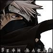
Mmm, it looks like the basis for a great signature.
Decrease the contrast - while I do like contrast, the one here is a tad too hard.
Use transparency - let the San Fran fly out of the picture, same way as I did with Lunaphase and Eternal's sigs.
Move the text. Right now, it just sits in the middle of nowhere, disrupting the otherwise nice composition of the picture. Should you include transparency, move it into a transparent are where it doesn't disturb the image flow. (also, maybe use another font or shadow filter).
Add stuff in the black background. Not too much, but some decent, far-away stars would be great, I think.
Contrast is beauty. The problem here is the font. Also, what's in the upper right hand side? Either expand upon that or get rid of it.
The proportions, decrease the height while keeping the width. As for font, you can use it to balance the picture. I'm not sure how to say this (too much whiskey at the moment), but it can be used to balance the picture rather than more planets or a starscape. Check out the following link for fonts:
Right, It's time to update my signatures again, this time I'm introducing a new sig as well as converting from the gif monstrosity i have right now, I'll be using a site that randomly switches the images.
your input and constructive criticism is greatly appreciated.
First is an Update to my Toliman signature:
I recently learned how to color manga images and have learned how to create my own palates.
Next I'll introduce my new character, Alan Mosinger. However I cannot chose between form a, or form b so I'll leave that up to you guys.
Form A
Form B
I also need a render of the Zoner whale. I'd do it myself, however I keep getting an error every time I try to convert it from Milkshape to 3ds Max. (milkshape crashes for the Zonerwhale only)

![[Image: SanFran-1.png]](http://i130.photobucket.com/albums/p272/Sedrander/SanFran-1.png)
![[Image: SethSig.png]](http://i130.photobucket.com/albums/p272/Sedrander/SethSig.png)

![[Image: 72g0tg.jpg]](http://i39.tinypic.com/72g0tg.jpg)
![[Image: GlossyNew2copy-1.png]](http://i195.photobucket.com/albums/z57/dopamino/GlossyNew2copy-1.png)

![[Image: GhostSleip.png]](http://i281.photobucket.com/albums/kk206/gabelzahnmoos/My%20Signatures/GhostSleip.png)

![[Image: toliman3.png]](http://i124.photobucket.com/albums/p29/matthias251a/toliman3.png)
![[Image: mosinger.png]](http://i124.photobucket.com/albums/p29/matthias251a/mosinger.png)
![[Image: mosingerb.png]](http://i124.photobucket.com/albums/p29/matthias251a/mosingerb.png)
![[Image: Cmdrtoliman.png]](http://i124.photobucket.com/albums/p29/matthias251a/Cmdrtoliman.png)
![[Image: sarge17bravo.png]](http://miniprofile.xfire.com/bg/sh/type/2/sarge17bravo.png)
![[Image: SaxophileSignature.png]](http://i655.photobucket.com/albums/uu279/crimsonxzr/Other/SaxophileSignature.png)
![[Image: Signatures.png]](http://i655.photobucket.com/albums/uu279/crimsonxzr/Other/Signatures.png)
![[Image: Characters.png]](http://i655.photobucket.com/albums/uu279/crimsonxzr/Other/Characters.png)
![[Image: Stories.png]](http://i655.photobucket.com/albums/uu279/crimsonxzr/Other/Stories.png)