Ed I really like your background image there, though the text looks out of place. Perhaps less blur on the ship could be good aswell, though the lighting is good. (Not that I'm actually in RM so my opinion on this doesn't matter)
' Wrote:Calego, can you please try a little darker colloration?
More like this color:
And Johann, thats a hell of a good sig. *looks around and whistles*
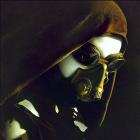
Darker... hmmm ok but it may get a little hard to see... I'll edit or post the new ones in a bit
EDIT:
ok hows this:
Blank:
Haupt...:
Admiral:
Like Mining or Transporting RP? Join the ZoE. Interested in Corporation RP? Contact the ZoE.
All Signature Payments/Donations go to "SS.Lucky.Credit" (No quotes).
The signature itself looks very good, but after you made it darker, there are only few contrasts and the text seems to disappear in the background. Try to add more contrasts.
The signature itself looks very good, but after you made it darker, there are only few contrasts and the text seems to disappear in the background. Try to add more contrasts.
And in my humble opinion it is way too big.
Yeah, if you get the text more visible again via using the contrast, it might be a hit. Well about the size....it seems to be a bit larger than normal sigs and the big battleship over the border adds some additional visual effect.
Maybe resize it a little, but not too much, I have a feeling that it would look odd then.
The signature itself looks very good, but after you made it darker, there are only few contrasts and the text seems to disappear in the background. Try to add more contrasts.
And in my humble opinion it is way too big.
' Wrote:Yeah, if you get the text more visible again via using the contrast, it might be a hit. Well about the size....it seems to be a bit larger than normal sigs and the big battleship over the border adds some additional visual effect.
Maybe resize it a little, but not too much, I have a feeling that it would look odd then.
Tough crowd tough crowd... thats good I need practice ok I'll try to improve the contrast a little, make the text more seeable and resize it... I agree it is a little big... I guess because of the borders I used on it...
I'll get back to you with V4 soon
EDIT:
oky dokey: V4 with V3 side by side compare
I hope you like it...
Blank:
Haupt....:
Admiral:
the thing is now considerably smaller as you can see but the text is a bit small as well... It's still readable though so no worries. I sharpened up the contrast on the whole thing ant made the primary text (not rank) lighter so it stands out more, and I gave it a drop shadow to help differentiate it from the BG.
Like Mining or Transporting RP? Join the ZoE. Interested in Corporation RP? Contact the ZoE.
All Signature Payments/Donations go to "SS.Lucky.Credit" (No quotes).
Thanks a lot Calego. The size is better now, at least I guess so.
The Short ADMIRAL thing looks good in it. Hauptfeldwebel is the longest, but I think still readable.
Lets wait until our Commie Penguin honors us with a cool sig.
Thanks a lot, even at this point of our indecisiveness *laughs*
Me neither... May the best Sig maker win...
I won't say you're not the most picky Sig requester I've had but I like that. You know what you want and you don't want anything less... Thats good.
Like Mining or Transporting RP? Join the ZoE. Interested in Corporation RP? Contact the ZoE.
All Signature Payments/Donations go to "SS.Lucky.Credit" (No quotes).
And the Runner-up (as decided by myself (or perhaps a vote of people in Rheinland Military on the USA server).)
Gets to win 50M as well. (Don't worry, I've built a trader on this server, so it will be paid in GC server credits.)
(for the Photoshop file, not an image of it, because, I'll need to adjust it to our rank system.)
Because Rheinland Military on the USA Server can do with Forum Signatures too.

![[Image: jXWPvRb.png]](https://i.imgur.com/jXWPvRb.png)

![[Image: sanstitre1copievp0.png]](http://img406.imageshack.us/img406/1005/sanstitre1copievp0.png)
![[Image: 2zof0w4.jpg]](http://i25.tinypic.com/2zof0w4.jpg)
![[Image: 24qtg5g.jpg]](http://i27.tinypic.com/24qtg5g.jpg)
![[Image: am31oy.jpg]](http://i29.tinypic.com/am31oy.jpg)
![[Image: 4424_s.png]](http://signavatar.com/4424_s.png)
![[Image: image.png]](http://xcomm.de/discosig/image.png)

![[Image: image.png]](http://xcomm.de/discosig/malexa/image.png)
![[Image: Rh_Image4.png]](http://i895.photobucket.com/albums/ac153/edphilips38/specials/Rh_Image4.png)
![[Image: inftzq.jpg]](http://i25.tinypic.com/inftzq.jpg)
![[Image: okn2on.jpg]](http://i30.tinypic.com/okn2on.jpg)
![[Image: 30121sl.jpg]](http://i27.tinypic.com/30121sl.jpg)
![[Image: audrey03a.png]](http://img714.imageshack.us/img714/7610/audrey03a.png)