Take off the huge girl and add more paradise to it, beaches sands' swimming pools think, If you were to go on holiday what would you love to see on a picture? Add it. Post back.
No thanks, not the type of Logo were looking for..
I decided to give a try as well. I'm not really known around here with making "this and that"...I mostly work in private and I have few customers from time to time.
Here is my OSC LOGO for you. I hope you will choose mine:), if not I think I will use it for my own indie liner 8-)
Internity, I really like the logo. If you could, try making another version with the following changes.
1. Create the replica of the logo (logo2, from now on)
2. Place logo2 underneath the original logo
3. Remove all FX from the logo2
4 Create 1 pixel outter stroke. This should give it a thin black definition line, but the original's blur will be on top. The final result should be defined logo with a light blur.
User was banned for: banned pending staff discussions
Time left: (Permanent)
1.On both sigs make 1px black stroke borkder (outside) -it will make it look crispier.
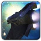
2. On left parts, where the space sceneis, you absolutely HAVE to adjust levels. I know you are using GIMP and I dont know how it is there, but you gota adjust mid tones to be darker and highlight to be lighter. Ifyou dont have that, try adjusting Brightness and Contrast. On the bottom image, look how the body, the water and the mountain are kind of countrasty? The image looks sharp. Now look at your left part of the image. The whole image looks plain and all in mid-tones. The highlight in the liner should be brighter, the purple galazy in the background should be brighter and have saturation (color color), the overall space should be darker. Right now it is all in the middle, if you understand what I am trying to pin point.
I will send you a pm with the link to your image where I played around with levels, to demonstrate what I meant.
User was banned for: banned pending staff discussions
Time left: (Permanent)


![[Image: OSC2.png]](http://anomander.nazwa.pl/FL/OSC2.png)
![[Image: Final_Sig_US_2_blue_ship.png]](https://cdn.discordapp.com/attachments/903663430207152128/904134583510007819/Final_Sig_US_2_blue_ship.png)
![[Image: THsCLuA.png]](http://i.imgur.com/THsCLuA.png)
![[Image: fnPLZH6.png]](http://i.imgur.com/fnPLZH6.png)
![[Image: 26PSva8.png]](http://i.imgur.com/26PSva8.png)
![[Image: RALsZal.png]](http://i.imgur.com/RALsZal.png)
![[Image: OSC3.jpg]](http://anomander.nazwa.pl/FL/OSC3.jpg)
![[Image: OSC32.jpg]](http://anomander.nazwa.pl/FL/OSC32.jpg)
![[Image: del0ff8-6ae63268-e37c-480b-a9a1-44137339...GwgitMB7x4]](https://images-wixmp-ed30a86b8c4ca887773594c2.wixmp.com/f/5cd2b623-bb9e-4b23-a168-13801e44d21e/del0ff8-6ae63268-e37c-480b-a9a1-4413733979d8.png?token=eyJ0eXAiOiJKV1QiLCJhbGciOiJIUzI1NiJ9.eyJzdWIiOiJ1cm46YXBwOjdlMGQxODg5ODIyNjQzNzNhNWYwZDQxNWVhMGQyNmUwIiwiaXNzIjoidXJuOmFwcDo3ZTBkMTg4OTgyMjY0MzczYTVmMGQ0MTVlYTBkMjZlMCIsIm9iaiI6W1t7InBhdGgiOiJcL2ZcLzVjZDJiNjIzLWJiOWUtNGIyMy1hMTY4LTEzODAxZTQ0ZDIxZVwvZGVsMGZmOC02YWU2MzI2OC1lMzdjLTQ4MGItYTlhMS00NDEzNzMzOTc5ZDgucG5nIn1dXSwiYXVkIjpbInVybjpzZXJ2aWNlOmZpbGUuZG93bmxvYWQiXX0.JZyWKvfIsWyvt08IYqUbLyPXTC7RAwd9wGwgitMB7x4)
![[Image: bannerv3test.png]](http://img600.imageshack.us/img600/8338/bannerv3test.png)
![[Image: oscLOGO1byinternity.png]](http://i90.photobucket.com/albums/k247/RS-21/My%20pictures%20VRX/oscLOGO1byinternity.png)
![[Image: oscLOGO2byinternityV2.png]](http://i90.photobucket.com/albums/k247/RS-21/My%20pictures%20VRX/oscLOGO2byinternityV2.png)

![[Image: MdKMy6k.png]](https://imgur.com/MdKMy6k.png)
![[Image: oscLOGO3internityv3a.png]](http://i90.photobucket.com/albums/k247/RS-21/My%20pictures%20VRX/oscLOGO3internityv3a.png)