I like teschy's, not sure why. That templar looks really good there though, and the shape of the Sig is nice aswell.
However-for all of them, the flag looks awfull bad. I mean, it stands out like an apple in a pile of bananas.
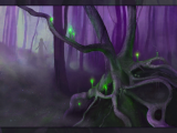
mwerte-I'm not too bug of a fan of the chair..., and the first one is better since it's darker than the rest, not sure about anyone else, but I like it better darker like that. The red might also be better than the white.
I like Teschy's the best too:
Bias? What do you mean? Pff, don't be rediculous, it looks nothing like mine.:P
Edit: Aye, Mwerte's are pretty badly pixelated and rather drab.
My advice: Don't use black as your background color and post it as a PNG instead of a JPEG.
Nooo! Not HardCMP, shots from there have no shading. Gimme a bit, I'll take a pic of my bomber in front of Planet Leeds; I'll use several different angles so you can choose which one you like the best.
I know you can touch it up with photoshop or the GIMP later, Dop. I'm not dumb or blind, in spite of popular opinion amongst my siblings.:PBut in-game you can get some things you can't get as easily in photoshop from a HardCMP shot: like the nice red canopy with both pilot and copilot in there, the running lights, Leeds in the background, etc. Eh well, whichever.

![[Image: Cg7QQEd.png]](http://i.imgur.com/Cg7QQEd.png)
![[Image: 14jn684.jpg]](http://i44.tinypic.com/14jn684.jpg)

![[Image: discsig2copy.png]](http://i190.photobucket.com/albums/z254/cristian_tescut/discsig2copy.png)
![[Image: GlossyNew2copy-1.png]](http://i195.photobucket.com/albums/z57/dopamino/GlossyNew2copy-1.png)
![[Image: 8898078.png]](http://i144.photobucket.com/albums/r167/equinoxgfx/Tags/8898078.png)