Trevelyan, I'll support this by donating 20mils to you so that you can pay up to 70mils to the best signature design, incase that would help convince more people to work on it and for longer, (so that submissions turn out in really great quality)
Expect to recieve the 20mils within a few days.
--Courtesy of The Chipper, the fastest, most "1337" Cargo Hauling Train in all of Sirius.
Yeah, your cool, try photoshopping out the Green targeting reticle from around that ship hidden by the asteroid in the green-ish section of the image... here I'll even circle it for you so you can see it better:
Other than that, It looks like a great start, In my opinion, even if im not the one running the contest...
That is very good, Ktayn. I really like the colors, and although the themes aren't necessarily visualized, they're in there in a nice way.
For an avatar, would it be possible to use the translucent section at the bottom, shrunk, and just with "IMG" in the center (but still with the "compartments" that part currently has)?
Other ideas could include something like a shield with a compass sort of symbol (old world or not) and a mallet, perhaps set against a sort of sheet metal background with bolts along the edges. This is just off the top of my head, but those sort of capture the four activities of the Guild.
I will go back a little on what I said before. While I don't want IMG reduced to just mining, mining obviously is the heart of what we do (at least in 4.85), and everything else serves that central function.
Any more takers? It's still open, and DieSol's generous offer has certainly sweetened the pot.
I thought of a good design for a logo. Problem is, I do NOT have the skills NOR the right programs to create it well. Coreldraw is the worst sig/logo making program ever, but I may be biased 'cause I'm just so crap at using it...
Ok, here what I whipped up in 5mins. Hopefully it might kickstart the creativity of someone capable of doing this better than me.... Who has photoshop... and time to spare.... and... I'm done.
Crummy I know, but yea.. Basic idea is four buttons of different colours representing the different areas IMG specialise in:
Brown = Mining/trade
Blue = Research
Red = Defence
Yellow = Exploration
My idea is that in a sig, you can then make a certain button 'glow' for what division a particular character is in.. (possibly with the character's ship shown somewhere)
IMG text is self explanatory. The bluey gray oval - was wanting to make a more sheild-like shape, but was lethargic. It didn't fit right and couldnt be stuffed making it do so, so I made it an oval instead.
Was thinking one can put little icons on each button to better represent the different specialties, like the mallet and so on, but I left it out since anything I'd make it would look really retarded and out of place.
If anyone wants to use this design or modify it, whether it be heavily or merely cosmetic, you have my permission. Because this is as far as I'm taking it.
EDIT: <strike>Wow... that's frikin huge... Have to upload a smaller pic... ><"</strike> Fixed
logo already cropped out. since was not one I figured something mining related for origins, the gun is a "Jackhammer" from some game representing strength (defense etc) and of course you have your hardened steel border for building.
The Signature template there has the compass for exploration and a spacey background.
Encheta: Having colors represent functions is not a bad idea (though research and exploration go together - the other function is shipbuilding). Otherwise, it's a bit plain. I'd hope for a sig to have more graphics - space, ships, that type of thing. Though for an icon/avatar, what you have might be a good start for something. Of course, that depends on the eventual sig chosen - they'd obviously need to connect. One thing that might be possible is for some different graphics on the part that says IMG, but then a section (somewhere on the sig) with a color and name, associating with the division. Only problem there is that we have a number of members with multiple chars in different divisions...
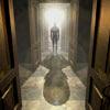
Teufelich: Very interesting, but it looks like it would be more fitting for mercs or bounty hunters than IMG. The compass symbol is nice, but the background there doesn't suggest space to me. The icon/avie part just doesn't work for me either. We don't use jackhammers (IMG does asteroid mining with ship-guns, not planetary mining with drills, etc), and firearms aren't really part of our repertoire, either. The border's not bad.
Ktayn: Any way you could do a border around the whole sig, just something like what's around the translucent section?

![[Image: VDG-Teufelich-X001.png]](http://void-design-group.com/ResourcePics/VDG-Teufelich-X001.png)

![[Image: img_box2-1.png]](http://i346.photobucket.com/albums/p431/ktayn/img_box2-1.png)
![[Image: 4986_s.gif]](http://signavatar.com/4986_s.gif)
![[Image: imgsigqk6.png]](http://img225.imageshack.us/img225/1456/imgsigqk6.png)
![[Image: kbeb.png]](http://i280.photobucket.com/albums/kk162/MarvinCZ/BAF%20Sig/kbeb.png)
![[Image: Gateway-fin.png]](http://i263.photobucket.com/albums/ii147/Slainte1967/Gateway-fin.png)

![[Image: 2hywd52.jpg]](http://i37.tinypic.com/2hywd52.jpg)
![[Image: 2h7jsztlb8.png]](http://img380.imageshack.us/img380/4268/2h7jsztlb8.png)
![[Image: IMG-sig-template-x001.png]](http://void-design-group.com/ResourcePics/IMG-sig-template-x001.png)