Signature violates 1.7, please resize:
1.7 - Pictures that exceed 700px width or signatures that exceed 700*250px*3 MB are not allowed on the forum.
Mephistoles
right now you just slapped Mr Bond on the background of an exploding planet and added its name.
Again, colour scheme does not fit with either component
Think about using artistic brush (they can be downloaded, search for tech brush and abstract brush among others, but remember not to abuse of them)
' Wrote:I'm evil, I know. It's the style of Yue Fei:
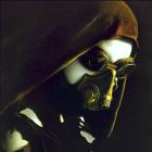
It's lacking some details... ideas?
Looks cool, but I'd suggest a border or something to make the logo look less standoffish. Also, I'm not a huge fan of the character render, really. The pastel-ish effect just isn't doing it for me, and it seems a bit dry. Not sure about the background either.
THEY TOLD ME I COULD BE ANYTHING SO I BECAME A SIGNATURE PLS HLP
@Ventana: better, though the render looks way too grainy compared to the background. Also, I'd prefer the cross not breaking out of the border, but being inside it, without the shadow.
@Seth: simple composition is good, but as Yue pointed out, you should watch out for your colours; they should always match each other or create a smooth contrast - for starters, it's easier to make either warm-themed or cool-themed sigs.
Downsize the sig, downsize the font, make it a tad less centered, adjust the colours of Mr Craig's face, so it seems as if he's affected by the explosion behind him - a warm, red/orange-filter about his face layer should the trick. You can also play with burn/dodge to get the shadows/brightness right.

![[Image: GlossyNew2copy-1.png]](http://i195.photobucket.com/albums/z57/dopamino/GlossyNew2copy-1.png)
![[Image: audrey03a.png]](http://img714.imageshack.us/img714/7610/audrey03a.png)
![[Image: ishibani.png]](http://img99.imageshack.us/img99/5376/ishibani.png)
![[Image: image.png]](http://xcomm.de/discosig/image.png)
![[Image: Aai7V.png]](http://i.imgur.com/Aai7V.png)
![[Image: ishibani.png]](http://img216.imageshack.us/img216/5376/ishibani.png)

![[Image: GhostSleip.png]](http://i281.photobucket.com/albums/kk206/gabelzahnmoos/My%20Signatures/GhostSleip.png)

![[Image: harlequincopy.png]](http://i210.photobucket.com/albums/bb305/Dlunar/harlequincopy.png)