Thanks for the feedback.Yes, the avatar was a little on a scary side, yesterday I thought it was funny. What was I thinking?
Ok, now back to business. On the second version, like you wanted, I made army into the smaller size and increased the image of Thades. Now you can see a little bit of his armor. Text has been moved above the army, per your request.
On the third version I took the liberty of changin Thades into a horseman (or should i say "Horsemonkey"). That way there is a better view of the armor and even the weapon.
User was banned for: banned pending staff discussions
Time left: (Permanent)
Bain: I pick the new updated version 1. thats cool. put the name of Mugatu over his picture in a small brick like the primusian text and it is almost done I think.
Anoma: pal thats a lot better I mean srsly a LOT. I prefer the text on the second.
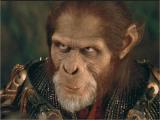
Makc. version one is coolious. I really like it. Keep the character picture since the gorilla with the armor among the horsemonkeys is not Hwl Mugatu so we will need his picture there (and remember that there are other chars whos pics should be planted on the wery same spot os we have to think for the future aswell). Btw I love the multiple lines of soliders. it looks great. I was not even hoping more than one line of those apelings on horses.
k Mak. stay tuned. We are waiting for the other artists versions, otherwise your sig will be the etalon- precisely something what we imagined.
Anoma: something between this 2. the apelings should stand straight so they are better in the pic 1- but I prefer the text on the 2nd version. keep the green glow aorund the text and space.
Otherwise its good one.
Bain: Precisely. I love the text size of the 1st version- just make it a bit less...erm...bright. possibly it would be more cool with less shining and with added radioactive -soft glow. Otherwise if we not count this your version isfinished and we like it. Its clear- and not too noisy-possibly if you have time to sacrifice: you could play with the army of the monkeys to put them in a distance possibly in multiplied lines since ive fall in love with the dozens of horsemonkz ( On the background of Maks work). But it is great thisways aswell. Dunno.
again: thanks gents and stay tuned. we will wait for the others to finish their attempts. there are still 4 artist who are currently working on this project-we wont trumpie out a winner before we did not see their jobs.
Hell yeah Anoma. ohh one more thing. make the green a bit lighter. thisway its a bit Rheinlandier. It should be a bit more...radioctive. other than that its cool.
' Wrote:Hell yeah Anoma. ohh one more thing. make the green a bit lighter. thisway its a bit Rheinlandier. It should be a bit more...radioctive. other than that its cool.
edit - make more hazardus green - background and letters with neon

![[Image: primusansver2q.jpg]](http://img253.imageshack.us/img253/7178/primusansver2q.jpg)
![[Image: primusansver3.jpg]](http://img407.imageshack.us/img407/2449/primusansver3.jpg)
![[Image: apes2.png]](http://anomander.nazwa.pl/FL/apes2.png)
![[Image: del0ff8-6ae63268-e37c-480b-a9a1-44137339...GwgitMB7x4]](https://images-wixmp-ed30a86b8c4ca887773594c2.wixmp.com/f/5cd2b623-bb9e-4b23-a168-13801e44d21e/del0ff8-6ae63268-e37c-480b-a9a1-4413733979d8.png?token=eyJ0eXAiOiJKV1QiLCJhbGciOiJIUzI1NiJ9.eyJzdWIiOiJ1cm46YXBwOjdlMGQxODg5ODIyNjQzNzNhNWYwZDQxNWVhMGQyNmUwIiwiaXNzIjoidXJuOmFwcDo3ZTBkMTg4OTgyMjY0MzczYTVmMGQ0MTVlYTBkMjZlMCIsIm9iaiI6W1t7InBhdGgiOiJcL2ZcLzVjZDJiNjIzLWJiOWUtNGIyMy1hMTY4LTEzODAxZTQ0ZDIxZVwvZGVsMGZmOC02YWU2MzI2OC1lMzdjLTQ4MGItYTlhMS00NDEzNzMzOTc5ZDgucG5nIn1dXSwiYXVkIjpbInVybjpzZXJ2aWNlOmZpbGUuZG93bmxvYWQiXX0.JZyWKvfIsWyvt08IYqUbLyPXTC7RAwd9wGwgitMB7x4)
![[Image: sig-22626.jpg]](http://www.clintonio.com/sig-22626.jpg)
![[Image: Primus5-1.png]](http://i843.photobucket.com/albums/zz354/Stedman67/Primus5-1.png)
![[Image: Primus6.png]](http://i843.photobucket.com/albums/zz354/Stedman67/Primus6.png)
![[Image: apes2_2_2.png]](http://anomander.nazwa.pl/FL/apes2_2_2.png)
![[Image: apes2_3.png]](http://anomander.nazwa.pl/FL/apes2_3.png)
![[Image: apes2_5.png]](http://anomander.nazwa.pl/FL/apes2_5.png)
![[Image: apes2_6.png]](http://anomander.nazwa.pl/FL/apes2_6.png)
![[Image: apes2_7.png]](http://anomander.nazwa.pl/FL/apes2_7.png)