So I was gonna use this in a small side project, but somehow it became a second side project, and I got inspired.
See this?
I'm getting bored of it, as great as it is.
So I give you the first draft of my new proposed splash screen!
EDIT: New one...
Sorry its so much bigger, can be scaled down easy enough.
Can also be used as a background if you like it.
Tell me what you like(and dislike) and think about it.
This is only a draft, more versions and improvements to come.
I too agree, the original is usually the best, but having said that, if everything stayed the same, there'd be no mods, if one thinks on a wider scale.
Kennedy once said "there is nothing more uncertain of change, than change itself."
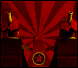
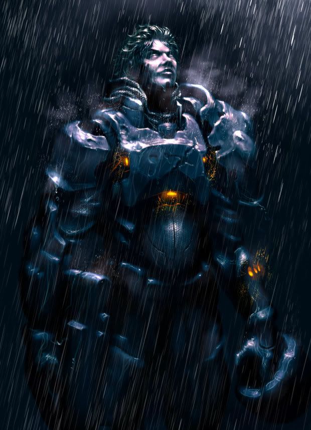
As for what Violette has created, they are quite good, although I do prefer the first one more, mainly due to the blend of colors, the 2nd is too dark.
I'll be honest, dear, they're very pretty, but the splash screen we have now is better; it was done by an old, old friend of mine and Igiss, who also happens to be a proffessional, and I think his is more effective and detailed.
Quote:Quick comment - we thought that Panzer was the Leader, Swift. -Agmen
Well first, what's wrong with the planet in the first one?
And the second picture is too complex and complicated for the splash screen. A very important part of advertising is presenting a good-looking picture that shows what it needs to and keeps the viewer's attention on the important parts of the photo. In this case, that is the Reunion Symbol. The current photo is very good at getting the viewer's attention centered around the center of the photo, while the background enhances the looks without overpowering the original reason for the picture.
In your first picture, the planet just sticks out like a sore thumb. And the Fleur de Lys is too blue and uniform, little texture or depth to it. In the second picture, there is so much going on in the background that the reader is naturally drawn to the detail there. That, coupled with the fact that the Fleur de Lys is blended in with the dark side of a planet and using dark coloring, most people won't really notice it. Their attention will be more focused on the background and that's what they would remember, not the icon for Discovery, which is where their attention should be.
Notice how the current photo just pulls your eyes towards the center by using the coloring, going from dark to light as it goes from outside to inside. Your pictures don't offer anything to make you notice the symbol, but does the opposite.. And that's why it just isn't up to par. Advertisement is more than pretty backgrounds.

![[Image: screen459.th.jpg]](http://img36.imageshack.us/my.php?image=screen459.jpg)
![[Image: discovery485splashcopy.th.png]](http://img193.imageshack.us/my.php?image=discovery485splashcopy.png)
![[Image: discovery485splash2draf.th.png]](http://img44.imageshack.us/my.php?image=discovery485splash2draf.png)
![[Image: stacywinterscopy3.png]](http://img130.imageshack.us/img130/2037/stacywinterscopy3.png)
![[Image: Panic2.jpg]](http://i183.photobucket.com/albums/x2/RonG777/Panic2.jpg)

![[Image: CrlBx.gif]](http://i.imgur.com/CrlBx.gif)

![[Image: DFinal.png]](http://i22.photobucket.com/albums/b328/Luciaden/DFinal.png)
![[Image: 11841570.png]](http://imageshack.com/scaled/large/52/11841570.png)