The sig's definitely got something, Cabulb. I love the colours. How many layers did you use that it took you 3 hours?:P
Great job as always!
---
2 new pics. I don't know why I'm still using signature sizes, I'm not using every picture as a sig, but the second just became my new one... I did mention I'm running out of ideas, didn't I?
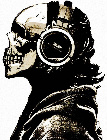
@ Cabulb, it's good except that the Name is hard to read. Where's that Ship from?
@ I m rdy, the blue Signature looks better than the bigger yellow/green/red Signature. Also, you should try something else. >_< Sorry, but most of them are very similar. Especially because of the same Shape and Border. You should try to create Wallpapers.:P
I made this Communication Image. I am not doing many of those it's my third Communication Image I think. The Effect on the Font doesn't work with the IPB Default Forum Skin.
"Who is it doing this synthetic type of alpha beta psychedelic funkin'?"
You know, using the Stroke Layer Style barely looks good. Especially not using it in a Render. Just press CTRL and Left Mouse Button to select the Layer of your Render (looks like marching Ants) then go to Select -> Expand. Then use one or two Pixels, depends how big you want it. Create a Layer below the Ship and go Edit -> Fill and take a Colour you want.
Also works with Characters and the Signature itself.
"Who is it doing this synthetic type of alpha beta psychedelic funkin'?"
' Wrote:You know, using the Stroke Layer Style barely looks good. Especially not using it in a Render. Just press CTRL and Left Mouse Button to select the Layer of your Render (looks like marching Ants) then go to Select -> Expand. Then use one or two Pixels, depends how big you want it. Create a Layer below the Ship and go Edit -> Fill and take a Colour you want.
Also works with Characters and the Signature itself.


![[Image: screwingaround2.png]](http://i480.photobucket.com/albums/rr166/bassmasta992/screwingaround2.png)
![[Image: alive2.png]](http://i273.photobucket.com/albums/jj219/I_m_rdy/alive2.png)
![[Image: nowings.jpg]](http://i273.photobucket.com/albums/jj219/I_m_rdy/nowings.jpg)

![[Image: Transmission.png]](http://i768.photobucket.com/albums/xx328/schlurbii/Discovery%20Stuff/Transmission.png)
![[Image: Newgoldensigfinishawesomecoolcolours.png]](http://i768.photobucket.com/albums/xx328/schlurbii/Signatures/Newgoldensigfinishawesomecoolcolours.png)

![[Image: adn41u.jpg]](http://i55.tinypic.com/adn41u.jpg)
![[Image: malenka.gif]](http://rotasig.com/rotasig2/sigs/malenka.gif)

![[Image: discosig02.png]](http://img543.imageshack.us/img543/8/discosig02.png)
![[Image: siggyu.png]](http://img820.imageshack.us/img820/6346/siggyu.png)
![[Image: R8pppB2.png]](http://i.imgur.com/R8pppB2.png)
![[Image: corsaircopy.png]](http://i843.photobucket.com/albums/zz354/Stedman67/corsaircopy.png)