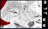
Seth Wrote:I don't think the guys head should cover the writing, but other than that, nice sig.
Also a tiny bit too colourful for me, maybe change the levels a tad...
Yus, I was worried about the head coverage myself, but I couldn't figure much else out since it was supposed to be narrow. See bottom for address of second caveat.
Ivan, that's a French-A name, Ivaaan Wrote:magoo - they rock
Thank ye.:)
Frozen Wrote:magoo. the work is nice, however, i think you could lighten up the guy, perhaps give his face some highlights. mostly dark, with a few parts that are lit up brighter than the rest of the body. would look nice.
So I guess this is the bottom. I think your strategies are bold, Frozen and I'll try to fiddle with it, although having burnt his face to Jassy and back, and me being just-okay with Photoshop, I'm not really confident in my abilities. I'll try though.
Caveat! I'll hold off publishing any changes to the Phantoms in case they like the original, but if they just say, "Make it better," and don't specify, then I'll do as everyone suggested. Thanks for the feedback, everyone.:D