MT: yeah the new logo has a lot better color. A lot more like Mollys and not the RM.
otherwise I think the knot thing wont make it common, or so. it could even improve the image a bit...I think at the end it will be a matter of thinking and not matter of shape.
focus on the border (frame patterns). I think its pretty. Forget the pentragam and imagine the leaf there.
or this. This one is for the borders aswell. I mean to show an example what I ment:
and finally:
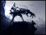
on this last I wanted to mark 2 things: The border (frame) and the pattern of the stags back-leg. You could cut off the pattern from the ,,wing-thing,, like this (not the pattern but the method).
Remember thos people put those symbols and patters to almost all n every accesible space. ,,Naturam abhorret a vacuum" and those celts had enough time and talent to fill up the ,,empty space,,. It was not l'art pur l'art. it was a way of thinking. Even If Im not sure that Mollys should represent that... I thikn it looks cool.
So I guess it would be a great and beautiful idea. Those patterns are the natures fight aganist the empty-dead space- thats why you could fill your logo up with them. to represent that wiev.
I wont say more. It's still your logo. But it would be even more cool with celtic patterns and kewl quality textures.
Sorry if i disturbed ya with my ideas.
And I've found the logo of the Irish football club:P

![[Image: celticstarkeychain.jpg]](http://img30.imageshack.us/img30/4301/celticstarkeychain.jpg)
![[Image: celticwicca.gif]](http://img693.imageshack.us/img693/852/celticwicca.gif)
![[Image: celticstag.jpg]](http://img714.imageshack.us/img714/1567/celticstag.jpg)
![[Image: agent111th.png]](http://img19.imageshack.us/img19/9417/agent111th.png)