' Wrote:I always suggested people starting to work art to start with something small. Its easier to manage.
Larger things like a screen background, Im not so good at it.
I'm much better at 1920x1080 than 700x200, pour example. It varies per person really. I find small canvas' to be crowded, chaotic. And whenever that happens I have a brainfailure. Which, in some cases, does wonders. Odd that is.
' Wrote:I'm much better at 1920x1080 than 700x200, pour example. It varies per person really. I find small canvas' to be crowded, chaotic. And whenever that happens I have a brainfailure. Which, in some cases, does wonders. Odd that is.
Some of my best sigs are from "experiments" so i see where ya coming from.
' Wrote:Some of my best sigs are from "experiments" so i see where ya coming from.
Yeah, like "spur of the moment" stuff. That's when I do my best "work".
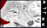
Did this at college. Do not ask why. Just throwing it out here, but I got some ideas to make it purrettier myself. Any ideas? http://i210.photobucket.com/albums/bb305/D...10_09150002.jpg
Keep in mind that I'm using my phone for photography. I picked it just for that, but it ain't no mirrorflex camera.
The fiery effect behind and around the EVE logo is pretty nice, though, the fact it goes only in one direction annoys a bit. Maybe if it had a more explosive effect? The actual effect gives the impression it is in motion, while the logo itself doesn't seems like a moving element of the composition.
The noise effect... hm. I think it should either be reduced, or blurred out, it's way too obvious right now, especially in the darker area, we easily spot out a grainy texture.
I think if you reduced the glow of the font, or replaced it by shadows, could be an alternative to make it look less... standing out, and more faded in the picture.
Otherwise, I still do prefer version without stations and stuffs.


![[Image: PrincessSignaturecopy.png]](http://i930.photobucket.com/albums/ad144/Korolia/Gallia/PrincessSignaturecopy.png)

![[Image: harlequincopy.png]](http://i210.photobucket.com/albums/bb305/Dlunar/harlequincopy.png)

![[Image: 25yzu4l.jpg]](http://i46.tinypic.com/25yzu4l.jpg)
![[Image: maverickivpng.png]](http://img715.imageshack.us/img715/324/maverickivpng.png)
![[Image: maverickivpng.png]](http://img526.imageshack.us/img526/324/maverickivpng.png)

![[Image: 5d1144bd1.png]](http://i84.photobucket.com/albums/k13/gurjiv/5d1144bd1.png)