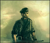
Its a new sig I made for a Bundschuh character. I think some parts are really blurry, but it looks a whole lot better than the previous version I made in which the text was crystal clear. I didn't like the text being crystal clear however because the anti aliasing was really, really bad, so yeah, I figured blurring was better. Used both Photoshop and Fireworks to make it. Does anyone want me to upload the previous version for a comparison?
(By the way, the guy's name is Erich Eichmann in case anyone couldn't read it).

![[Image: finalfeedback.jpg]](http://img229.imageshack.us/img229/107/finalfeedback.jpg)