' Wrote:I'm no rogue, but i know graphics... I'd make the entire logo the same color (like it is on the ships...) that way you would avoid the wierdly out of place white spots...
Erh, it's not suposed to be -that- D:
It was all suposed to be Red like the "skull"
Edit:
Edit Nr 2: Heres another Banner, mostly for funsies and I wanted to use the Texture of the Rogues:P
Edit Nr 3: Aaand heres another one:)Got really weird with the Texture:P
Edit Nr 4: New attempt ^^ and again, I love the texture:P
Edit Nr 2: Heres another Banner, mostly for funsies and I wanted to use the Texture of the Rogues:P
Edit Nr 3: Aaand heres another one:)Got really weird with the Texture:P
Edit Nr 4: New attempt ^^ and again, I love the texture:P
ah why not... I'll help out another graphic artist for a change...
the last one and the third one are ones that I would choose, simply because they are similar to my style and i like the looks my style creates... The text in the third one could use some touching up though, a bit too plain for my liking. However, you may not view them as rogueish... In which case you'd want the first two... to me they say rogue more than anything else. the font is just awesome for the rogue theme. as is the cracked sort of effect in the bg. The ships stand out a wee bit too much though, But its a banner and thats a ok.
The text in the second to last one is cool, really cool. But the rest of it is iffy. Besides the text and logo nothing shouts or even whispers rogues to me. I would try to implement the text idea into another one.
A very good job in these... Lots of effort. You think outside the box (like how you used the textures) and that is never a bad thing. Go very far you will, Mmmmmm...
EDIT: one more comment on the first two... the engine recreation (engine thrust, trail w/e you call it). Good job with that, you did it well enough that I didn't notice at first... It is insanely hard to get an effect like that to look natural (which is why I don't bother trying:P) but you did a good job. Its not quite natural looking of course but it doesn't look half bad... Good work.
Like Mining or Transporting RP? Join the ZoE. Interested in Corporation RP? Contact the ZoE.
All Signature Payments/Donations go to "SS.Lucky.Credit" (No quotes).
Heh, thanks:)Well, actually the reason for all of these posts of different kinds of banners was to see if the LR wanted to put one part in one sig into another to create a Banner theyd like. Since for an sig creator it's hard to know excatly what the "customer" wants:P
But thank you for the comments:)
Oh and the engine effects wherwe hand drawn and took a little while to get "ok" but I dont see it as to good:P
' Wrote:Heh, thanks:)Well, actually the reason for all of these posts of different kinds of banners was to see if the LR wanted to put one part in one sig into another to create a Banner theyd like. Since for an sig creator it's hard to know excatly what the "customer" wants:P
But thank you for the comments:)
Oh and the engine effects wherwe hand drawn and took a little while to get "ok" but I dont see it as to good:P
Believe me I know what you mean... *roll eyes*
Yeah i figured they were hand drawn, but still they do look good. The fact that you used multiple colors means you put in more effort than I would have.
Like Mining or Transporting RP? Join the ZoE. Interested in Corporation RP? Contact the ZoE.
All Signature Payments/Donations go to "SS.Lucky.Credit" (No quotes).
I like Serp's second one, myself. We don't fly Scyllas. (Mothers excluded)
Zealot Wrote:Just go play the game and have fun dammit.
Treewyrm Wrote:all in all the conclusion is that disco doesn't need antagonist factions, it doesn't need phantoms, it doesn't need nomads, it doesn't need coalition and it doesn't need many other things, no AIs, the game is hijacked by morons to confuse the game with their dickwaving generic competition games mixed up with troll-of-the-day.

![[Image: Gunsoflibert2.png]](http://i33.photobucket.com/albums/d70/Casiuz/Gunsoflibert2.png)
![[Image: Sonsoflibert2.png]](http://i33.photobucket.com/albums/d70/Casiuz/Sonsoflibert2.png)
![[Image: LibertyRogues.png]](http://i33.photobucket.com/albums/d70/Casiuz/LibertyRogues.png)
![[Image: newLRbanner.png]](http://i33.photobucket.com/albums/d70/Casiuz/newLRbanner.png)
![[Image: Sonsoflibertysigsized.png]](http://i33.photobucket.com/albums/d70/Casiuz/Sonsoflibertysigsized.png)
![[Image: Serpentis.gif]](https://sig.grumpybumpers.com/host/Serpentis.gif)

![[Image: 4424_s.png]](http://signavatar.com/4424_s.png)
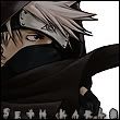
![[Image: SethSig.png]](http://i130.photobucket.com/albums/p272/Sedrander/SethSig.png)
![[Image: rogues.png]](http://img249.imageshack.us/img249/7773/rogues.png)


![[Image: Newgoldensigfinishawesomecoolcolours.png]](http://i768.photobucket.com/albums/xx328/schlurbii/Signatures/Newgoldensigfinishawesomecoolcolours.png)